PNG vs JPG vs WebP: Which Image Format Should You Choose?
PNG, JPG, and WebP each shine in different situations. Here's a clear, practical guide to picking the right format for photos, graphics, and modern websites.
A designer I know once spent an entire Friday afternoon trying to figure out why her portfolio site felt sluggish. The layout was clean, the copy was tight, the hosting was decent. But every page took forever to appear on a phone. When she finally opened her browser's developer tools, the answer stared back at her: every single project thumbnail on her homepage was a 4 MB PNG. Beautiful, pixel-perfect, and completely unnecessary. Swapped for well-compressed JPGs and WebPs, the same page shrank from 38 MB to under 2 MB. The visual difference? None you could see without a magnifying glass.
That kind of story plays out on the web every day. People agonise over fonts and colours, then upload whatever image the export dialog spat out by default. Choosing between PNG, JPG, and WebP is one of the smallest technical decisions you can make — and one of the highest-leverage. Get it right and your pages feel snappy. Get it wrong and you're serving your visitors ten times more data than they need.
Why image formats matter more than most people realise
Images are, by a wide margin, the heaviest thing most websites serve. The HTTP Archive's annual reports consistently show images accounting for roughly half of an average page's weight — more than JavaScript, CSS, and fonts combined. That weight translates directly into slower load times, higher bounce rates, worse Core Web Vitals scores, and, if you're running an online business, lost revenue.
The format you save an image in decides how efficiently those bytes are packed. A photograph saved as a PNG can easily be ten times larger than the same photograph saved as a well-tuned JPG, and neither will look different to a human eye at normal viewing distance. Multiply that by every image on every page, and the difference between "good format choices" and "whatever the export button suggested" becomes the difference between a site that feels professional and one that feels broken on mobile data.
Format also affects things beyond raw size: whether an image supports transparency, whether it degrades gracefully at low quality, whether it animates, and whether every browser your visitors use can actually display it. Understanding what each format is really for is the difference between guessing and choosing.
What JPG actually is
JPG — or JPEG, the two names refer to the same thing — has been the default image format for photographs on the web since the mid-1990s. It was designed by the Joint Photographic Experts Group specifically for photographic images: natural scenes, portraits, anything with smooth gradients and continuous tones.
JPG uses lossy compression. That means it throws away information that human eyes are least likely to notice, exploiting the fact that we perceive changes in brightness more sharply than changes in colour, and that we struggle to see fine detail in busy, textured areas. The result is a file that looks nearly identical to the original but contains a fraction of the data.
The catch is that JPG doesn't handle everything well. Because it's tuned for smooth photographic content, it struggles with sharp edges — text, logos, screenshots, line art. Save a screenshot of a code editor as a JPG and you'll see fuzzy halos around every letter. Save a family photo as a JPG at quality 80 and it will look indistinguishable from the original while being ten times smaller than a PNG.
JPG also doesn't support transparency. Every JPG has a solid rectangular background, which is why logos and icons saved as JPG often end up with an awkward white box around them.
What PNG actually is
PNG — Portable Network Graphics — was created in the late 1990s as an open replacement for the older, patent-encumbered GIF. Its design goals were the opposite of JPG's: pixel-perfect fidelity and support for transparency.
PNG uses lossless compression. Every pixel in the saved file is exactly the pixel you put in. Nothing is thrown away. That's why PNG is the right choice for anything where a single altered pixel would be noticeable: logos, icons, UI screenshots, diagrams, illustrations with flat colours and sharp edges, and any image that needs a transparent background.
PNG also supports full alpha transparency, meaning each pixel can be anything from fully opaque to fully transparent with 256 levels of translucency in between. That's what lets a logo sit cleanly on any background colour without the ugly white rectangle problem.
The trade-off is size. Because PNG preserves every pixel, it produces enormous files for photographic content. A 12-megapixel photograph saved as PNG can easily reach 20 MB or more. The same photo as a JPG at quality 85 might be 1.5 MB. For a photograph, that difference is nearly always invisible; for your load times, it's catastrophic.
What WebP actually is
WebP is the newcomer, and by now not really new — Google released it in 2010 and it's been supported in every major browser since 2020. It was designed specifically for the modern web, and its central pitch is that it does everything JPG and PNG do, only smaller.
WebP supports both lossy and lossless compression modes. In lossy mode, it typically produces files 25 to 35% smaller than an equivalent JPG at the same visual quality. In lossless mode, it produces files roughly 20 to 25% smaller than PNG. It also supports full alpha transparency, so it can replace PNG for logos and icons while cutting their weight substantially. And it supports animation, which means it can also replace clunky animated GIFs at a fraction of their size.
In other words, WebP isn't a specialist format like the other two. It's a general-purpose format that happens to be more efficient than either of them at the job they were originally designed for.
Compression, quality, and where the bytes go
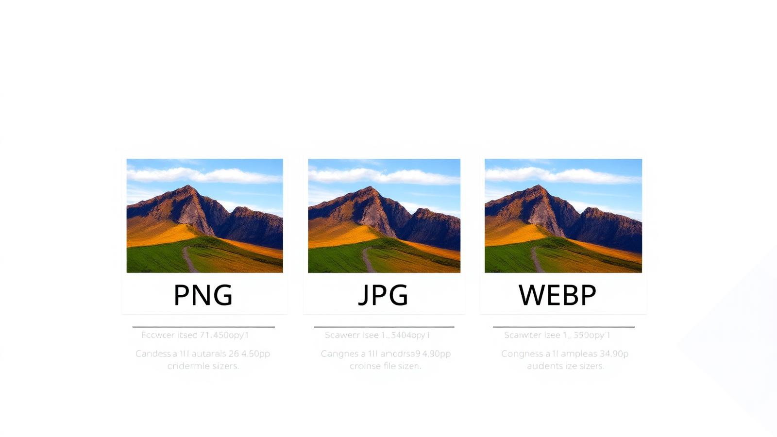
The clearest way to understand these three formats is to look at how they treat the same image.
Take a typical photograph — say, a landscape shot from a phone, roughly 4000 pixels wide. Saved as PNG, it might be 15 MB. Saved as JPG at quality 85, it drops to around 1 MB with no visible difference. Saved as WebP at a similar quality, it lands closer to 700 KB, still with no visible difference. That's the same photograph, same dimensions, same perceived quality, delivered in a twentieth of the bytes.
Now take a logo — a flat two-colour design with sharp edges and a transparent background. Saved as PNG, it might be 30 KB and look perfect. Saved as JPG, it can't preserve the transparency at all, and any attempt to save it produces visible artefacts around the edges. Saved as lossless WebP, it drops to around 22 KB and looks identical to the PNG.
The pattern is consistent: for photographic content, JPG beats PNG dramatically and WebP beats JPG modestly. For flat graphics with sharp edges or transparency, PNG beats JPG (which can't even do the job properly) and WebP beats PNG modestly.
One important nuance about quality settings: the top of the scale is enormously expensive in bytes for almost no visible gain. Going from JPG quality 100 down to 85 typically halves the file size while producing an image no human on Earth could distinguish from the original at normal viewing distance. Chasing pixel-perfect quality at zoom levels no visitor will ever use is one of the most common ways to waste bandwidth.
Transparency: the feature that decides a lot of choices
Transparency is the single feature that most often forces a format decision. If any part of your image needs to be transparent — a logo that sits on different-coloured backgrounds, an icon overlaid on a hero image, a product photo cut out from its original scene — then JPG is off the table. Full stop. JPG cannot represent transparent pixels at all.
That leaves PNG or WebP. Both handle full alpha transparency well. WebP produces smaller files for the same visual result, so for a modern site, it's usually the better pick — as long as you're happy with the browser support situation (which, as we'll see below, is essentially universal in 2026).
Browser compatibility in the real world
This used to be the reason people avoided WebP. It isn't anymore. WebP has been supported in Chrome, Firefox, Edge, and Opera for well over a decade, and Apple added support in Safari 14 back in 2020. By 2026, WebP is supported by more than 97% of browsers in active use worldwide, including virtually every mobile browser your visitors are likely to have.
The tiny remaining sliver — mostly very old devices that can't be updated — is small enough that most sites simply serve WebP directly. If you want to be belt-and-braces careful, the HTML <picture> element lets you serve WebP to browsers that support it and fall back to JPG or PNG for the ones that don't. But for most projects, that's optimising for a rounding error.
JPG and PNG, of course, are supported literally everywhere. They're the safe default, but "safe" and "best" aren't the same thing.
Which format to use, and when
Rather than memorising rules, it helps to think about what's actually in the image.
If it's a photograph — anything with gradients, skin tones, natural textures, bokeh, or continuous colour — reach for WebP first, JPG second. Both will produce dramatically smaller files than PNG with no visible loss.
If it's a logo, icon, or flat graphic with sharp edges and limited colours, use PNG or lossless WebP. If transparency is involved, one of these two is your only real option.
If it's a screenshot — a UI mockup, code sample, or annotated diagram — PNG or lossless WebP will preserve the sharp edges and legibility of text. JPG will visibly blur the details.
If it's animated content, forget animated GIFs entirely. Animated WebP or, better still, a looping muted MP4 or WebM video will cut the file size by 90% or more while looking dramatically better.
If it's a vector graphic — logo, icon set, illustration you drew in Illustrator or Figma — export it as SVG when you can. SVG is a different kind of format entirely (described mathematically rather than as pixels), but for the kinds of images it suits, it's smaller and sharper than any raster format at any zoom level.
Common mistakes worth avoiding
A few patterns show up on slow websites so often they're worth calling out.
The biggest one is using PNG for photographs. It happens constantly, usually because someone right-clicked a photo somewhere and the default save format on their operating system was PNG. The result is a page bloated by a factor of ten for no visible benefit. If it's a photograph and you don't need transparency, it should not be a PNG.
The mirror-image mistake is using JPG for graphics with sharp edges. Screenshots of code, diagrams with thin lines, logos with crisp outlines — JPG's compression smears them all. If you've ever seen a logo with fuzzy halos around the edges, that's a JPG doing its worst.
Uploading images straight from a phone or camera without any processing is another routine source of pain. A modern phone photo can easily be 4 to 6 MB. A page with five of them is 25 MB before a word of text loads. Resize before uploading — a blog content column that's 800 pixels wide has no use for a 4000-pixel-wide image.
Relying on CSS to shrink an oversized image is the same mistake wearing a disguise. The image looks small on screen but is still huge over the network, because the browser downloads the full file before it scales it.
And finally, saving everything at maximum quality "just in case." For JPG and WebP, quality 100 buys you nothing your visitors can see, and it can double or triple the file size compared to quality 85.
How the right format improves website performance
Every kilobyte saved is a kilobyte your visitors don't have to wait for. That matters more on mobile than on desktop, more on patchy networks than on fibre, and more on long pages than on short ones. Google's Core Web Vitals — the performance metrics that feed into search rankings — pay especially close attention to the largest visible image on the page, because that's usually what users are actually waiting for.
Choosing the right format is a first-order lever on all of this. A page that swaps 8 MB of oversized PNGs for 800 KB of well-tuned WebPs will feel qualitatively different: text appears sooner, the hero image snaps in instead of drifting down the screen, and the whole experience stops feeling like it's being delivered through treacle. Search engines notice. Visitors notice, even if they can't articulate why.
There's a business dimension too. Cloudflare, Akamai, and every major e-commerce platform have published data over the years showing that bounce rates rise sharply after the three-second load mark. The right image format is one of the cheapest ways to stay well under it.
The future of image formats
WebP isn't the end of the story. AVIF, based on the AV1 video codec, is the next step: it typically produces files half the size of an equivalent JPG at the same visual quality, and it now has support in every major browser. The encoding is slower and more CPU-intensive, and very large AVIFs can struggle to decode on older devices, but for most static site content it's a genuine leap forward.
JPEG XL, another modern format, offers a compelling mix of features — including the ability to losslessly re-encode existing JPGs at smaller sizes — but its browser support story is still unsettled, so it's not yet a safe default.
For the foreseeable future, a sensible modern site will lean on WebP as its everyday workhorse, use AVIF where the audience skews toward recent browsers, and fall back to JPG and PNG for maximum compatibility. That mix will cover essentially every visitor while keeping page weight down.
Pulling it all together
Choosing between PNG, JPG, and WebP isn't complicated once you stop thinking of them as interchangeable. JPG is for photographs where transparency doesn't matter. PNG is for graphics with sharp edges, flat colours, or transparency. WebP is a more efficient replacement for both, and in 2026 there's rarely a reason not to use it as your default.
Do that consistently and you'll typically cut your total image weight by more than half, often much more, without a visible loss of quality. Your pages will feel sharper, your Core Web Vitals will improve, and your visitors will stick around longer — even if none of them could tell you exactly why the site feels better than the last time they visited.
If you'd like to put any of this into practice without installing software, IntuWebTools has a small set of free, browser-based utilities that cover the essentials — an image converter for switching between PNG, JPG, and WebP, an image compressor for trimming file size, and an image resizer for getting the dimensions right before you upload. Everything runs locally in your browser, so your images never leave your device.